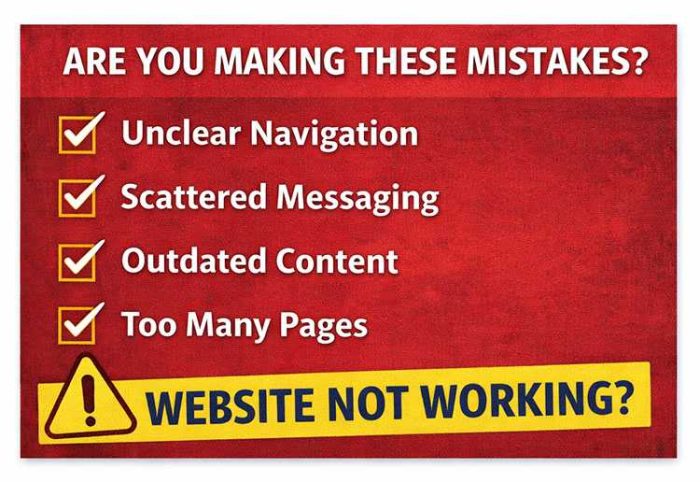
Most campaign websites have one of two problems: they are either missing key pages, or they are filled with pages that don’t do much.
Some campaign sites launch with just a homepage and a short bio. Others include everything: long issue pages, press releases, photo galleries, event listings, and endorsements. But more pages do not automatically make a stronger website. If there is no clear direction for the voter, the site still falls short.
Most voters won’t read your entire website. They’ll skim. They may look for a few key signals about your background, your issues, or the office you’re running for. If your site doesn’t provide those answers quickly, they’ll move on.
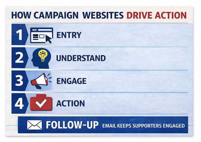
A campaign website works best when it has the right pages, with a clear purpose behind each one. Many voters will find your website by searching your name, and if it doesn’t quickly confirm who you are, what you’re running for, and what they should do next to support you, they probably won’t stay long.
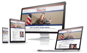
At Online Candidate, we’ve been building campaign websites for over twenty years. We’ve seen what works and what doesn’t. Here’s what your campaign website actually needs—and how each part should work.
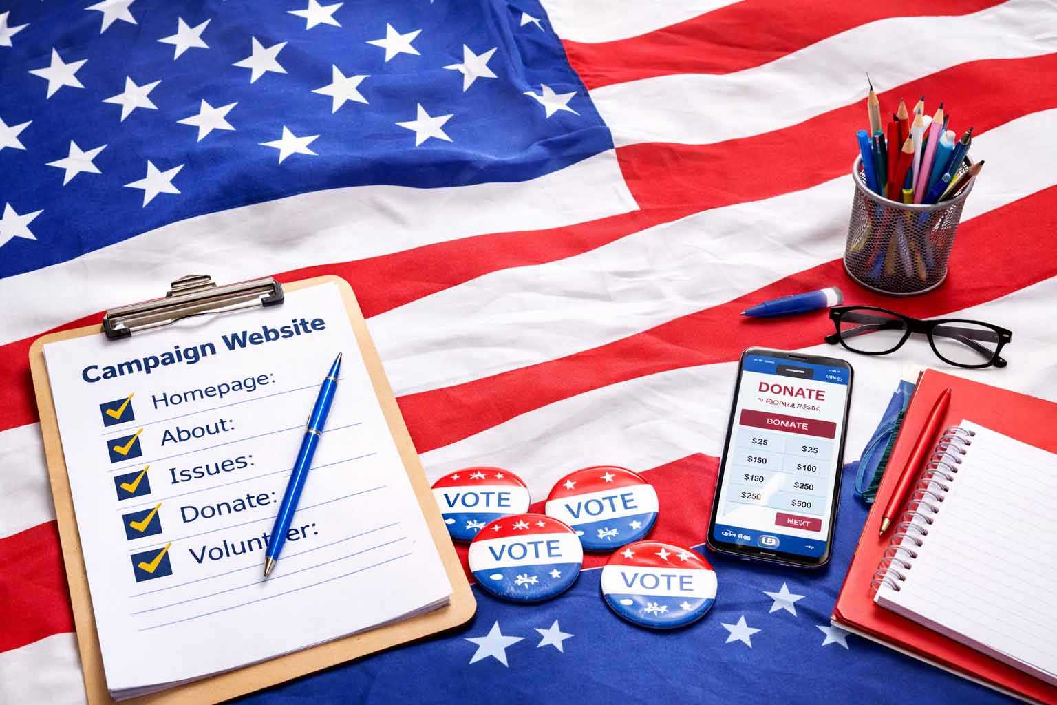
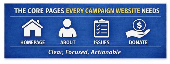
The Core Pages Every Campaign Website Needs
An effective campaign website is built around a small set of core pages. These pages help voters understand who you are, what you’re running for, what you stand for, and how they can support you.
The goal is not to add as many pages as possible. As you build your campaign website, you want include the pages that matter, make them easy to find, and give each one a clear purpose.
Homepage
Your homepage is the most important page on your campaign website. For many voters, it’s the first—and sometimes only—page they’ll see.
Within a few seconds, visitors should be able to tell who you are, what office you’re running for, where you’re running, and what they should do next.
At a minimum, your homepage should include:
- your full ballot name
- the office you’re running for
- your city, county, district, or state
- the election date
- one clear call to action
If any of those are missing or hard to find, you’re creating friction immediately.
This sounds obvious, but campaigns miss these basics more often than you might think. One candidate built a website and never used their full name on it. They used a nickname instead, and it didn’t match the name voters would see on the ballot. That creates confusion for voters and weakens the site’s ability to rank for the candidate’s actual name.
We also see key information buried halfway down the page, split across multiple sections, or left out entirely. A voter should not have to scroll or search just to understand the basics of your campaign.
Your main call to action should be obvious. In most cases, that means asking for the vote and reminding visitors of Election Day. Depending on where someone is in the campaign cycle, you may also ask them to donate, volunteer, request a yard sign, or join your email list.
A simple homepage test is if someone lands on the page for five seconds, can they answer these three questions?
- Who is this candidate?
- What are they running for?
- What should I do next?
If not, the homepage is not doing its job.
A weak homepage message might be: “Committed to our community and fighting for change.”
That may sound positive, but it does not tell voters who the candidate is, where they are running, what office they are seeking, or when the election takes place.
Here’s a stronger homepage message:
Jane Smith for City Council – District 3
Vote November 5
[Donate] [Volunteer] [Request a Yard Sign]
The difference is clarity. One sounds like a general campaign statement. The other gives voters the basic information they need and points them toward the next step.
About Page
The About page is usually the second most important page on a campaign website. It gives voters the background they need to understand who you are, why you’re running, and whether they can trust you.
The mistake many candidates make is treating this page like a resume. They list jobs, titles, degrees, boards, awards, and memberships, but never connect that experience back to the voter. It ends up reading like the candidate is applying for a job instead of asking for someone’s vote.
Your qualifications matter, but they need context.
A strong About page should answer:
- Why are you running for this office?
- What experience makes you qualified?
- What connects you to the community?
- How does your background shape the way you would serve?
If those answers are not clear, your biography can feel incomplete even if it includes plenty of information.
Tone matters here. If the page is too formal, it feels distant. If it’s too casual, it can feel unfocused. The best approach is clear and direct. Write the way you would explain your background to a voter in person.
One practical note: your About page may rank in search results for your name, especially if it has more copy than your homepage. Use your full ballot name, office, location, and campaign details naturally in the text. Otherwise, your biography may not support the searches voters are actually making.
Issues / Platform Page
The Issues or Platform page is where voters go to understand what you stand for. This page does not need to cover every possible topic. It needs to explain your most important positions clearly.
Your Issues page should:
- break topics into clear sections
- use headings and short paragraphs
- focus on issues that matter to your voters
- explain what you would actually do, not just what you care about
One of the most common problems with campaign website content is density. Long blocks of text, vague language, and no structure make the page hard to read, especially on mobile.
We see this often. Candidates try to say everything at once. They cover every large issue, every small issue, and sometimes issues that barely belong on the site. One candidate devoted an entire page to picking up after your dog, apparently thinking that a small local annoyance deserved the same treatment as a major campaign issue
That usually backfires.
An Issues page should not read like a policy archive. It should help voters quickly understand your priorities, your position, and how those positions connect to the office you are seeking.
Most people scan web pages rather than read them carefully. Use subheadings so voters can find the topics they care about. Keep each section short enough to understand at a glance, and add detail only where it helps.
For example:
Public Safety
Every neighborhood deserves a visible and responsive public safety presence. My priorities include:
- increasing neighborhood patrol coverage
- improving emergency response times
- supporting local police, fire, and emergency services
- strengthening communication between public safety departments and residents
Roads and Infrastructure
Local roads, sidewalks, and drainage problems affect daily life. My priorities include:
- repairing roads and sidewalks based on need, not politics
- improving drainage in flood-prone areas
- making infrastructure spending easier for residents to understand
This kind of basic structure is easier to scan. Voters can quickly find the issue they care about, understand where the candidate stands, and decide whether they want to learn more.
Donate Page
Your Donate page has one job: make it easy for someone to contribute.
That means:
- a clear headline
- a trusted donation platform or form
- minimal distractions
- a short explanation of how the contribution helps
- no competing calls to action
A visitor who clicks “Donate” has already decided to take action, so you don’t want to slow it down.
We sometimes see donation pages overloaded with text, extra links, long explanations, or multiple buttons leading in different directions. That creates friction. Every extra step gives someone another chance to leave before completing the donation.
Common donation page problems include:
- no donation system set up yet
- unclear donation buttons
- long paragraphs before the form
- too many links away from the page
- asking for too much information too early
- using a form that does not look trustworthy on mobile
The donation page needs to be set up correctly. Use a donation platform that is appropriate for campaign contributions and make sure it collects the information required under your campaign finance rules. A generic payment form may not be enough.
Keep the page focused. A short message above the form is fine, especially if it explains what donations help fund. But once someone is ready to give, don’t make them work to find the form.
Small changes on this page can have a measurable impact. Moving the form higher, simplifying the wording, improving the button text, or removing one unnecessary step can increase completed donations.
Volunteer Page
Not every supporter will donate. Some people want to help in other ways. Your Volunteer page should make it easy for them to take that first step.
Clearly explain how someone can help and include a simple sign-up form. That’s all you need. Don’t make people guess what “volunteer” means. Be specific about the kinds of help your campaign needs.
Common volunteer form options include:
- knocking on doors
- making phone calls
- sending texts
- helping at events
- delivering or displaying yard signs
- collecting petition signatures, if applicable
- hosting a meet-and-greet
- sharing campaign updates online
A common campaign website mistake is using vague language like “Get involved” without explaining what that means. Specific requests work better.
Instead of: “Get involved with the campaign”
Use:
- “Help knock on doors this Saturday”
- “Make calls to voters in your district”
- “Request a yard sign for your home or business”
- “Join our volunteer team for upcoming events”
Keep the form short. Name, email, phone number, and a few checkbox options are usually enough. You can collect more details later. The goal is to get the supporter into your campaign’s follow-up process. Asking for too much information will keep people from signing up.
Contact Page
Your Contact page has a simple purpose: give people a clear way to reach the campaign.
At a minimum, include a contact form and campaign email address. You may also include a mailing address, phone number, or campaign headquarters address if you have one and want it public.
Keep this page simple. If a voter, supporter, vendor, or local organization wants to reach you, they should not have to search for basic contact information.
For journalists, you may want to add a short media note or link to your Media / Press page. That page can include a campaign bio, press contact, photos, press releases, and other background information about the candidate and campaign.
Email Signup
Email signup is not just a page. It is a function that should appear throughout your campaign website.
Use it to capture interest from people who are not ready to donate or volunteer yet, but still want to stay connected.
Include email signup:
- on your homepage
- in your footer
- on your Volunteer page
- on your Donate page
- below major updates or blog posts
- on any page where a visitor may want to stay informed
Many campaigns hide the email signup form in the footer, often near the campaign disclaimer. Others treat it as an afterthought. That is a missed opportunity.
An email list gives your campaign a direct way to share updates, promote events, ask for help, and remind supporters to vote. Social media is useful, but you do not control how many followers see each post. Email gives you a more reliable way to reach people when it matters.
Your signup form does not need to be complicated. In most cases, a name, email address, and ZIP code are enough to start. You can always collect more information later.
Your email list is one of the few campaign assets you actually control. Treat it that way.
Pages That Help—But Aren’t Always Required
Not every campaign needs a large website. A candidate for state office will likely need more content than someone running for school board, village board, city council, or local sheriff.
The mistake is adding pages just because other campaign websites have them. More pages do not automatically make a site better. In many cases, extra pages create more work, more thin content, and more places for outdated information to collect.
A simple rule: if a page will not be updated or actively used, leave it off the site.
Optional pages can be useful, but only when they support a real campaign goal.
Events Page
An Events page is useful if your campaign is actively holding appearances, town halls, fundraisers, meet-and-greets, canvassing days, or other voter outreach events.
This is where you want to make it easy for supporters to see what’s coming up on the campaign calendar and how they can participate.
Include:
- event names
- dates and times
- locations
- brief descriptions
- RSVP or registration links, if needed
- a clear call to action, such as attend, share, or volunteer
The main issue with Events pages is maintenance. We often see campaigns create an Events page, add a few early events, and then leave old listings online long after they have passed. That sends the wrong signal.
If you are going to include an Events page, keep it current. Remove old events or move them into a recap or news section. An outdated Events page can make a campaign look inactive.
If your campaign is not regularly hosting or promoting events, skip this page for now.
News / Updates / Blog
A News, Updates, or Blog section can help show campaign activity. It gives voters, supporters, and reporters a place to see what the campaign is doing.
Use it for:
- campaign announcements
- event recaps
- endorsements
- responses to local issues
- media mentions
- fundraising or volunteer updates
- voting reminders
This section can also help your website appear in search results over time, especially for searches related to your name, local issues, and campaign activity. But only add this section if you plan to use it.
We’ve seen many campaign blogs launched with good intentions and then abandoned after two or three posts. A stale blog can look worse than no blog at all. If the last update is months old, voters may wonder whether the campaign is still active.
Updates do not need to be long. A short announcement, a few photos from an event, or a brief statement on a local issue can be enough. The key is consistency.
Endorsements Page
Endorsements can strengthen credibility when they matter to the voters you are trying to reach. This section should display recognizable support for the candidate, not just collect names for the sake of having a long list.
Include:
- endorsing individuals or organizations
- titles or affiliations, when relevant
- short quotes, if available
- photos, when appropriate and permitted
A few strong endorsements are usually more effective than a long list of names that voters do not recognize. Quality matters more than quantity.
Sometimes we see campaigns treat endorsements like a numbers game. That can make the page feel padded. If an endorsement doesn’t carry weight with your audience, it may not need to be featured.
You can also use endorsements throughout the site instead of keeping them only on one page. For example, a public safety endorsement may fit well near your public safety issue section. A union, business, or community endorsement may support a related policy page.
If you have meaningful endorsements, make them easy to find. If you do not have them yet, do not create an empty page.
Campaign and Candidate FAQs
A frequently asked questions section can help clarify details and reduce confusion—especially when voters are looking for specific answers. What seems obvious to you may not be obvious to voters.
FAQs work best when they reflect real questions your campaign is receiving, not generic ones.
Common categories include:
- policy positions
- your background
- campaign logistics
- how and where to vote
For example:
Q: What are your plans to improve local schools?
A: Outline your specific approach, not general goals.
A few well-written answers can improve clarity and build trust. They also make it easier for voters to find information quickly without reading through full pages.
Avoid overusing FAQs. They should support your main content, not replace it.
We’ve seen clients add generic campaign website FAQs that don’t match what voters are actually asking or care about. Doing that just adds clutter without value.
FAQ Tips:
- keep answers clear and direct
- address difficult questions directly
- update content as your campaign evolves
- guide visitors to a next step (donate, volunteer, learn more)
Media / Press Page
This page is useful if your campaign is receiving coverage. It provides easy access to media mentions and press materials.
Include:
- links to articles or interviews
- press releases (if used)
- basic media contact information
If you’re not getting coverage, this page isn’t necessary. An empty or thin press page can make a campaign look smaller than it is.
Photo / Media Gallery
Images can help humanize your campaign—but this page is often overused and bloated.
Use it for:
- event photos
- community engagement
- campaign moments
We’ve seen galleries filled with dozens of similar images that don’t add much value. A smaller set of meaningful, high-quality photos is more effective.
In many cases, strong images can be integrated directly into your main pages instead of placed in a separate gallery.
What This Means for Your Website
You don’t need more pages. You need the right pages, with a clear purpose for each, and a structure that connects them into a whole.
When those pieces are in place, your website becomes more than information. It becomes part of how your campaign operates.
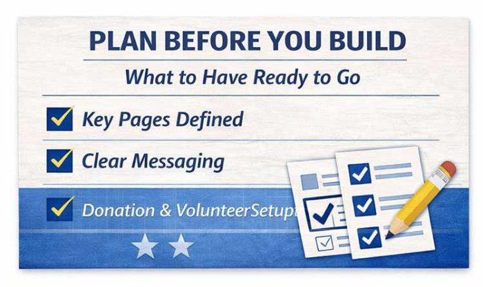
If you’re ready to move forward, follow this step-by-step guide to building your campaign website.
Read More:

")

Tags: messaging