Looking for examples of the best political campaign web designs? A good campaign website has to do more than look polished. It should quickly tell voters who the candidate is, what office they are seeking, and what the campaign is about. It should also make it easy to learn more, donate, volunteer, request a sign, or find voting information.
Plenty of “best political website” lists showcase sites the publisher had nothing to do with. We’re doing something different. Most of the examples below were custom-designed by Online Candidate for real campaigns. We’ve also included an example created by a campaign using our Monthly Campaign Website Builder. It shows what candidates can build themselves using the same campaign-focused platform.
The designs vary because the races do. A sheriff’s website shouldn’t look or read exactly like a school board or county clerk site. Each example takes a different approach while keeping the candidate, office, message, and next step clear.
School Board Website Design Centered on Education Experience
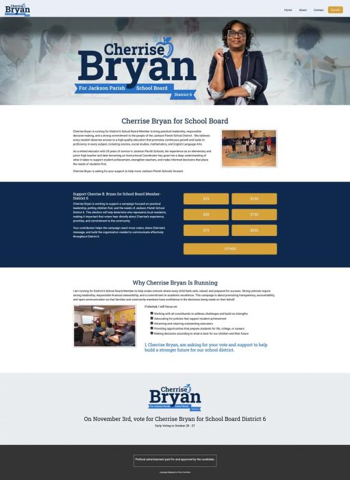
This school board campaign website immediately identifies the candidate, the office being sought, and the district. The large candidate name and portrait sit over softly muted classroom imagery, while the apple incorporated into the logo adds an education-specific detail without overwhelming the design.
Get Your Campaign Website in Place Early
Once your campaign gets underway, there will always be something more urgent to do. Setting up your website early gives you a place to introduce yourself, explain your positions, collect supporters, and accept donations when you are ready.
Online Candidate can build and set up your campaign website for you, or you can create your own with our Monthly Campaign Website Builder starting at $29/month.
The navy, blue, and gold color scheme continues through the donation section and gives the entire site a consistent identity. Photographs of the candidate with students in a classroom connect the campaign message to the candidate’s experience as an educator.
Why it works: The website does not rely on generic political imagery. Its branding, photographs, and content reinforce the school board race, while the donation buttons and election-date message give visitors clear next steps.
City Council Re-Election Website Built Around Experience
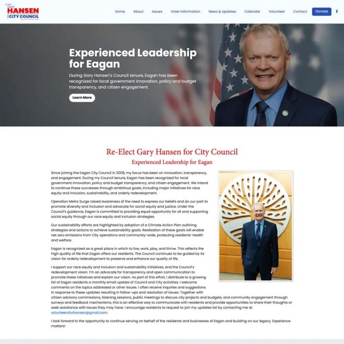
This city council campaign website is structured around the case for re-election. The opening message establishes experienced leadership as the campaign’s central argument before visitors begin reading about individual issues or accomplishments.
Our design approach: We built the site around the campaign’s strongest argument: a record of experienced leadership. The prominent portrait and civic imagery reinforce that message, while the expanded navigation gives an incumbent room to present issues, accomplishments, voter information, events, volunteer opportunities, and donation options.
Why it works: The design recognizes that an incumbent’s website has a different job from that of a first-time candidate. It emphasizes record, experience, and continued service rather than simply introducing the candidate.
Planning your own campaign website? Online Candidate offers professionally designed websites as well as a do-it-yourself monthly option. Answer a few questions to find the website option that fits your campaign.
Sheriff Campaign Website With Sign-Ready Branding
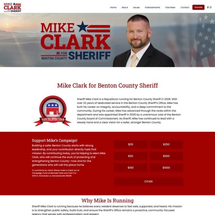
This custom sheriff campaign website establishes a bold visual identity immediately. The oversized name, star-and-stripe logo treatment, candidate portrait, and sheriff title make the candidate and office immediately clear.
Our design approach: We treated the website as part of a larger campaign identity. The logo, typography, colors, and graphic elements were designed to remain recognizable when carried over to signs, mailers, social graphics, and other campaign materials.
The red, white, and navy palette fits a public-safety campaign, while the landscape and flag background add geographic and patriotic context. A prominent red donation section creates a strong visual break and makes contributing one of the site’s primary actions.
Why it works: The site combines strong campaign branding with a straightforward conversion path. Visitors can quickly identify the candidate, understand the office, read about relevant experience, or contribute without searching through the site.
Issue-First School Board Campaign Website
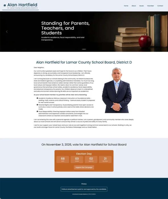
This school board website takes an issue-first approach. Instead of opening with an oversized candidate portrait, the hero section uses books, an apple, and a message centered on parents, teachers, and students. That makes the audience and the campaign’s education focus clear right away.
Unlike the custom designs featured above, this site was created using Online Candidate’s Monthly Campaign Website Builder. The campaign used the platform’s color, font, image, layout, and election-countdown options to create a distinctive website around its own message and materials.
The teal, dark blue, and orange palette avoids the standard political red-and-blue treatment while still appearing professional. The candidate portrait is placed beside a detailed introduction and clearly organized priorities. A countdown near the bottom turns the election date into a visible call to action.
Why it works: The design leads with the concerns of the office rather than the candidate’s name alone. It also demonstrates that a campaign can build a polished, office-specific website without ordering a custom design.
County Clerk Re-Election Website Focused on Results
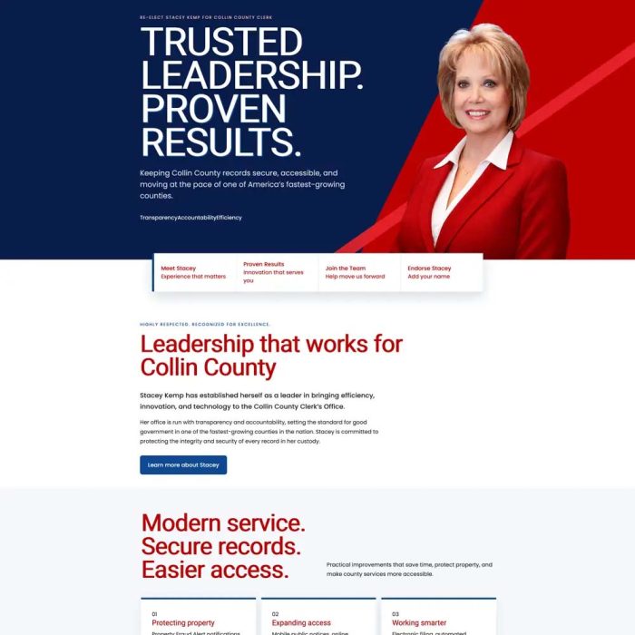
This county clerk campaign website uses a polished, contemporary design to make the campaign feel substantial and results-oriented. The oversized “Trusted Leadership. Proven Results.” headline creates a strong first impression, while the candidate portrait and angular red graphics give the page energy and visual direction.
Our design approach: We used large typography, strong color blocks, and a structured content layout to give the campaign a more contemporary presentation. The visual hierarchy leads visitors from the main campaign message to the service improvements and supporting details below.
The messaging is particularly well matched to the office. Rather than relying on broad political language, the page emphasizes secure records, easier access, efficiency, technology, and public service. The navigation panels beneath the hero guide visitors toward the candidate’s experience, accomplishments, campaign involvement, and endorsements.
Why it works: The design turns the responsibilities of the clerk’s office into clear voter benefits. Its visual hierarchy allows visitors to understand the campaign’s main argument before reading the supporting details.
State Senate Website With Distinctive Local Branding
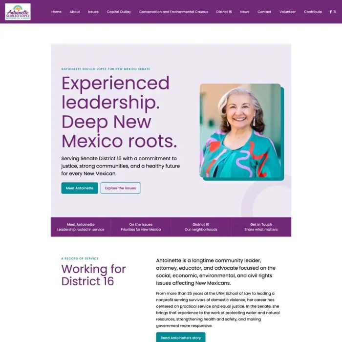
This state senate campaign website stands apart from more traditional political designs through its purple, teal, and coral color palette. The bright portrait and welcoming visual style give the campaign a distinctive personality while maintaining a professional appearance.
The headline combines experience with a clear sense of regional identity. Supporting navigation highlights the candidate’s background, policy positions, district, and contact options. The section below connects community service and professional experience directly to the work of the office.
Why it works: The site creates a recognizable political brand without relying on conventional red, white, and blue imagery. The colors, portrait, typography, and locally focused language work together to make the campaign feel both personal and grounded in the district.
Sheriff Campaign Website That Leads With Credentials
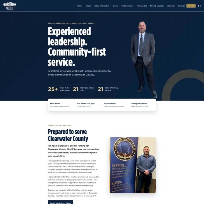
This sheriff campaign website places qualifications at the center of the design. The hero section combines a full-length candidate portrait with a message about experienced leadership and community-first service. A short credential strip immediately summarizes the candidate’s law-enforcement, police leadership, and military experience.
Our design approach: We designed the opening section to establish qualifications before asking visitors to explore the rest of the website. The experience figures support the leadership message with evidence that voters can absorb at a glance.
The dark navy and muted gold palette conveys authority without making the site feel severe. Bold condensed typography strengthens the public-safety theme, while action panels direct visitors toward the candidate’s background, yard signs, endorsements, and voting information. The next section supports the opening claims with additional information about the candidate’s record and community service.
Why it works: Sheriff candidates often need to establish credibility quickly. This design puts experience, service, and evidence above the fold while still giving supporters clear ways to learn more and participate.
What Effective Political Campaign Website Designs Have in Common
These political campaign website design examples don’t follow a single visual formula—and they shouldn’t. A school board candidate, county clerk, city council member, and sheriff should not all have interchangeable websites.
Even so, the examples share several important characteristics:
- The office is immediately clear. Visitors should not have to search the page to determine what position the candidate is seeking.
- The design supports the campaign’s main argument. Experience, education, public safety, constituent service, and local roots require different visual and messaging priorities.
- The branding can work beyond the website. Effective political campaign branding should translate to signs, mailers, social media, and print materials.
- Photography contributes to the message. Classroom, civic, community, and professional images provide context that a standard headshot cannot supply on its own.
- Visitors are given a next step. The site’s campaign pages and calls to action should make donation, volunteer, endorsement, yard-sign, contact, and voting information easy to find.
Photography is especially important. When we build websites, we find that large, clear photos work best. We can always scale down an image, but it’s tough to make small or blurry images better. A strong horizontal photograph with enough open space for headlines gives a designer far more flexibility than a tightly cropped vertical image. When possible, campaigns should gather several high-resolution portraits, community photographs, and office-relevant images before the design process begins. These political campaign photography tips explain what types of images work best online and in campaign materials.
Choosing the Right Political Website Design
There’s no single design that will be right for every campaign. Effective political campaign web designs reflect the office, the candidate’s background, the campaign’s central message, and the actions supporters should take.
A first-time campaign may need to focus on introducing the candidate and establishing credibility. An incumbent may need to highlight accomplishments and continued service. A sheriff candidate may lead with qualifications, while a school board campaign may place greater emphasis on education priorities and community involvement.
The design should communicate that argument before a visitor reads every word. When the photography, branding, message, and calls to action reinforce one another, the website becomes more than an online brochure. It becomes a working part of the campaign.
You can also view additional campaign website design examples created for local, county, state, and federal races.
Ready to create your campaign website? Compare Online Candidate website packages to choose professional setup, custom design with self-managed content, or the monthly campaign website builder.
Read More:


What’s Your Campaign Theme? »