A campaign website should do three things: clearly identify the candidate, guide visitors to take action, and support the campaign over time. Most campaign website mistakes happen when one of those three functions breaks down.
A campaign website is not a digital brochure. It’s a voter conversion tool.
Would you make a campaign stump speech, stop 90% of the way through, drop the mic, and walk off the stage? Would you send a print piece with half your message and leave the rest blank?
Of course not.
Yet many campaign websites do exactly that.
They explain the candidate. They list the issues. They might even collect donations. But they fail at the one thing that matters most: getting people to act.
If your campaign website does not guide voters to take a clear next step, it is not doing its job.
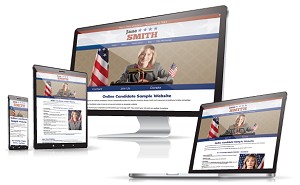
Online Candidate is a campaign website platform built specifically for political campaigns, with page structures designed around real campaign actions like donations, volunteer sign-ups, and voter communication. Many of the mistakes below come from trying to build those elements without a clear structure.
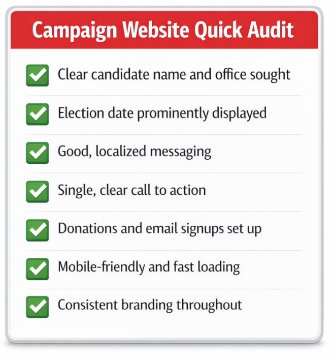
Campaign Website Quick Audit
Before diving in, here’s a fast check.
Your campaign website is likely underperforming if:
- voters cannot tell who you are, what you’re running for, and where within seconds
- your election date is not clearly visible
- pages don’t have one clear call to action
- email sign-up is missing or buried
- all traffic leads to the homepage
- your messaging sounds like any other candidate
A campaign website should reduce decision friction, not create it.
If you answered “no” to any of these, your website is leaving results on the table.
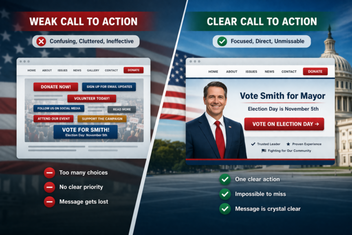
1. No Clear Call to Action
This is the most common—and most damaging—of the campaign website mistakes.
You can read an entire website and still not see the most important message:
Vote [Candidate Name] on [Election Date].
That’s the point of the campaign: telling people who to vote for and when. Yet many sites bury it or leave it out entirely.
Donation links and volunteer pages may be present, but if you’re not clearly asking for the vote, you’re leaving the outcome up to chance.
Every page should make the next step obvious to the reader:
- Vote
- Donate
- Volunteer
- Sign up
Don’t assume people know what to do. Tell them clearly and tell them everywhere.
A visitor might land on your homepage, a blog post, or a random internal page. You don’t control where they enter your site. If that page doesn’t clearly tell them what to do next, you’ve lost the opportunity.
The call to action should be:
- visible without scrolling
- repeated throughout the page
- consistent across the site
Just as important, keep it focused. A donation page should ask for donations. A volunteer page should ask for volunteers. On most other pages, the primary ask should be the vote.
Too many competing calls to action (CTA) create confusion. This is a major reason why many political campaign websites fail–they’re too scattered. One clear action drives results.
This isn’t just a local campaign issue. Some high-profile campaigns have focused heavily on policy or fundraising while burying the call to vote. Others make the call to action unavoidable across the site. The difference shows in how effectively those campaigns convert attention into turnout.
If your website doesn’t clearly and consistently tell voters to act, it’s not doing its job. Many of these issues come from how the site is built in the first place. Here’s how to build a campaign website step by step.
Should You Run for Local Office? A Practical Self-Assessment for First-Time Candidates
2. Treating the Website Like a Brochure
Many campaign sites are static. They present information about the political candidates, but they don’t drive any measurable action.
A campaign website is not a digital flyer. It’s a conversion tool.
Each page should have a purpose:
- persuade
- collect emails
- drive donations
- move voters closer to the ballot
If your site just “sits there,” it’s underperforming.
This is where a lot of campaigns go wrong. They focus on what they want to say, not what they want visitors to do.
A typical brochure-style site:
- lists a biography
- outlines positions
- maybe includes a few photos
And then… nothing.
No direction. No next step. No movement.
A strong campaign website is structured differently. It guides visitors:
- from learning ? to supporting
- from supporting ? to taking action
- from action ? to showing up on Election Day
That means every page should answer two questions:
- What does the visitor need to understand here?
- What should they do next?
If you can’t answer both, the page isn’t finished.
Brochure sites inform. Political campaign websites need to convert.
3. Missing Critical Information
You’d be surprised how often this happens. It’s one of the most common issues we see when reviewing campaign websites.
Visitors should know within seconds:
- who you are
- what you’re running for
- where
- when the election is
“Vote Smith for Mayor.”
Smith who? Mayor of where? Vote when?
If a voter has to figure out the who and where, they won’t bother. They’ll just leave.
Search engines (and voters) rely on clear, repeated signals to understand what your site is about. If your name, office, and location aren’t stated plainly throughout the site, you’re making it harder to show up when voters search for you.
We see these gaps often on local campaign websites. Basic details like district or election date are either missing or buried in the content. At a minimum, this information should appear:
- on your homepage
- in your page titles and headings
- in your footer
- across key pages like About and Issues
If you’re unsure what pages and details should be included, this is where most campaigns benefit from starting with a clear structure.
It should also be written the way voters actually search:
[Candidate Name] for [Office] in [City/State]
Not buried in paragraphs. Not implied. Stated clearly.
Many local campaign sites miss this entirely. They assume voters already know the details. Most don’t.
Your website is often the first introduction. Treat it that way.
If someone lands on your site and can’t immediately tell whether your campaign is relevant to them, you’ve lost them before you even had a chance to make your case.
4. Not Having Enough (or the Right) Content
Launching your political website is not the time to start writing your content.
If you’re building pages the day before launch, it shows. Thin sections, placeholder text, and incomplete ideas leave a poor first impression. Many campaigns plan to “fill it in later,” but that rarely happens once the campaign is underway. We’ve seen live candidate sites with unfinished pages linked directly from the main navigation. Voters notice.
Campaigns rarely have unlimited time or resources. That’s why structure matters more than volume.
At a minimum, your site should include:
- a clear biography
- your platform or key issues
- a reason to support you
But just having content isn’t enough. It needs to do actual work.
Your content should answer the questions voters are already asking:
- Who is this candidate?
- What do they stand for?
- Why should I trust them?
- What do they want me to do next?
If those answers aren’t clear, adding more content won’t fix the problem. Large blocks of text lose attention quickly, especially on mobile.
Break things up:
- short sections
- subheaders
- bullet points
Make it easy to scan and understand. Clarity beats volume every time. A short, well-structured page will outperform a long, unfocused one.
5. Weak or Generic Messaging
Campaign websites often sound like press releases. That’s a problem.
They rely on safe language, broad statements, and phrases that could apply to almost any candidate. After a few paragraphs, nothing stands out—and nothing sticks.
Voters want to understand who you are and why you’re running. That comes through in specifics, not polished generalities. Personal stories, direct language, and clear positions make it easier for people to connect with you and remember what you stand for.
At the same time, there’s a balance to maintain. Overly casual or unfocused campaign messaging can hurt credibility just as quickly as overly formal copy can create distance.
The goal is straightforward communication. Say what you mean in a way voters can understand quickly and recognize as your own.
A simple test: remove your name from a paragraph. Could it belong to another candidate? If so, it’s too generic.
Clarity wins—but specificity is what makes it work.
6. Not Asking for Support (Clearly Enough)
Every page should have a purpose, and that purpose should be obvious to the visitor.
- On a donation page, ask for donations.
- On a volunteer page, ask for volunteers.
- On your main pages, ask for the vote.
That sounds straightforward, but many campaign sites blur these lines. They stack multiple requests on a single page or bury the primary ask under too much content.
When everything is important, nothing stands out. It’s one of the most common issues we see when reviewing campaign websites. Pages try to do too much, and nothing converts well.
Too many calls to action on one page can be confusing. A visitor shouldn’t have to decide between donating, volunteering, signing up, and following social accounts all at once. Give them one clear action to take.
Focused pages perform better. A dedicated donation page will convert more than a general page with a small donation link. The same applies to volunteer sign-ups and email capture.
This is where structure matters. Different types of traffic should lead to different pages, each built around a single goal. Someone coming from a fundraising email should land on a donation-focused page. Someone clicking from a volunteer post should land on a page designed for that purpose.
That’s also where many campaigns run into trouble. They know what they want to ask for, but they don’t have the right pages set up to support it.
Campaign-specific website platforms, like Online Candidate, can help solve this by providing pre-built pages for donations, volunteers, and email sign-ups, already structured around a single action. Instead of building everything from scratch, you’re starting with pages designed to guide visitors toward a clear next step.
If you don’t ask clearly—and you don’t ask in the right place—people won’t act.
7. Poor Writing and Presentation
Spelling and grammar errors undermine credibility immediately.
If a candidate cannot communicate clearly, voters notice.
Would U vot for somone who spell liek this?
Probably not.
It’s the same reaction voters have when they see sloppy writing on a campaign website. It signals a lack of attention to detail, and that reflects on the candidate.
Before publishing anything:
- proofread everything
- have someone else review it
- check both web and print materials
What looks fine to you may stand out to someone else right away.
Presentation matters just as much as writing. A site with inconsistent formatting, hard-to-read text, or cluttered design makes it difficult for visitors to focus on your message. Instead of learning about your campaign, they’re distracted by how it looks.
On your site pages, avoid:
- too many fonts
- inconsistent layouts
- excessive colors
- ALL CAPS
These don’t make your message stronger. They make it harder to follow.
The same goes for structure. Long, unbroken paragraphs are hard to read, especially on mobile devices. Most visitors scan first and read second. If your content isn’t easy to scan with clear and readable subheaders, it won’t get read.
Keep it simple and readable. Clear writing and clean presentation make your campaign look organized, credible, and prepared.
8. No Email Capture or Follow-Up Strategy
A website alone does not win elections.
If you’re not collecting emails, you’re missing one of your most valuable campaign assets.
An email list allows you to:
- build a supporter base
- communicate consistently
- drive turnout
We see that email works, converts better, and is more visible than social media. It’s how you stay in front of voters between now and Election Day.
Many campaigns focus on social media, and it has its place. But you don’t control those platforms. Algorithms change. Posts get buried. Followers don’t always see what you publish.
Your website and your email list are different. They’re assets you own. More importantly, email gives you a direct line to people who have already shown interest in your campaign.
A typical flow looks like this:
- someone visits your website
- they sign up for updates
- they receive emails about events, issues, and deadlines
- they’re reminded when and how to vote
Without that follow-up, most visitors disappear and don’t come back.
This is where many campaigns fall short. They might have a sign-up form, but it’s buried or rarely used. Or they collect emails and never send anything meaningful.
Email only works if it’s part of a plan.
Make sign-up opportunities visible across your site. Give people a reason to join—updates, announcements, or reminders that matter to them. Then use that list to stay consistent and focused as Election Day approaches.
If you’re not capturing and using email, you’re relying on chance instead of building a system.
A website can generate donations, but it’s not an automatic ATM. It only works if your campaign is building attention and trust first.
9. Relying Too Much on Social Media
Some campaigns assume social media replaces the need for a website.
It doesn’t.
Social platforms are useful for outreach and engagement, but they are not a substitute for a campaign website. They’re rented space. You don’t control how your content is displayed, who sees it, or how long it stays visible.
Your website is different. It’s your central hub:
- where your message lives
- where donors contribute
- where voters confirm information
It’s also the one place where everything comes together. Your ads, emails, and social posts should all point back to it.
If someone hears your name and searches for you, what do they find?
It might be your website. It might be a social profile. It might be a news article—or something less favorable.
If you don’t define yourself online, someone else will.
That’s why your website matters. It gives you control over how your campaign is presented, what information voters see first, and what action they take next.
Social media supports your campaign. Your website anchors it.
10. No Promotion Strategy
A website does not generate traffic on its own. How will people find it?
You need a plan:
- search visibility
- social media
- advertising
- offline promotion
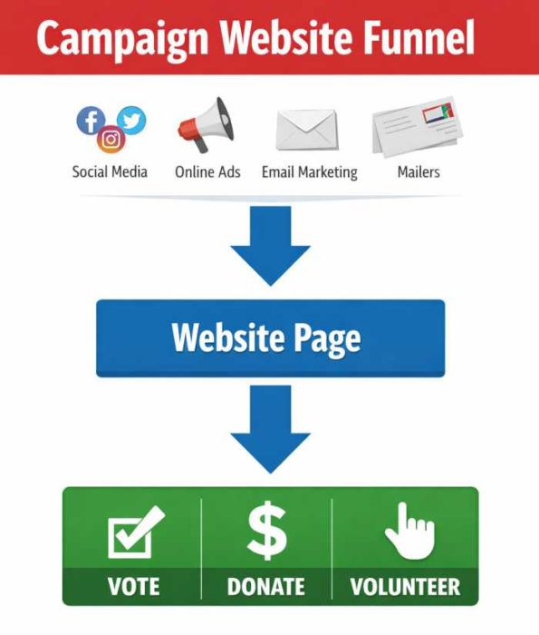
Your website is the destination—but you still need to drive people there.
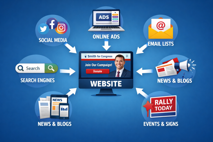
This is where many campaigns fall short. A common pattern is launching the site and waiting for traffic that never comes. In reality, most visitors arrive because something else sent them there.
That could be:
- a social post linking to your site
- an email asking for support
- a digital ad driving donations
- a mailer or yard sign with your web address
- a newspaper article covering the election
Each of these should point to targeted campaign landing pages. If everything leads to the homepage, you’re missing opportunities to convert interest into action.
Promotion and structure go together. A fundraising email should lead to a donation page. A volunteer post should lead to a sign-up page. A search for your name should land on a page that clearly explains who you are and what you’re running for.
Without a plan, your website becomes passive. It exists, but it doesn’t perform.
With a plan, it becomes the center of your campaign’s online activity—where attention turns into support.
11. Inconsistent Branding Across Campaign Materials
Your website, signage, and printed materials should match.
Inconsistent colors, logos, or messaging create confusion and weaken recognition. A voter might see your yard sign, then visit your website, and not immediately realize they’re connected to the same campaign.
That disconnect costs you.
A campaign is a brand. Treat it like one.
Branding starts with the basics:
- your name and campaign slogan
- your domain name and social media handles
- your logo, colors, and typography
These should align across every platform. If your website says one thing, your mailers say another, and your social profiles use different names or visuals, you’re making it harder for voters to recognize and remember you.
This happens more often than it should. Campaigns print materials before securing their domain name or social handles, then have to change course when those assets aren’t available. That creates inconsistencies from the start.
Once you establish your look, stick with it. That includes:
- using the same logo and color scheme everywhere
- keeping a consistent tone and message
- repeating key phrases so they become recognizable
Voters don’t see your campaign all at once. They see pieces of it over time. Consistency is what ties those pieces together.
An easy way to stay aligned is to create a basic style guide. This is where you define your colors, logo usage, fonts, and messaging, and make sure anyone working on the campaign follows it. Even small inconsistencies—slightly different colors, stretched logos, mismatched fonts—add up.
When everything looks and sounds like it belongs together, your campaign becomes easier to remember and easier to trust.
12. No Plan Before Launch
We’ve seen campaigns launch a site quickly, start promoting it, and then realize key pages are missing or messaging isn’t clear. At that point, they’re rebuilding while trying to run outreach at the same time.
Candidates often start building a website without:
- clear messaging
- structured content
- defined goals
So they improvise as they go along. Pages get created as needed. Content is written on the fly. Important elements are added later—if there’s time.
The result is a site that feels incomplete or inconsistent. Messaging doesn’t line up. Key pages are missing. Calls to action are unclear or scattered.
That’s a difficult position to be in, especially once outreach has already started. Fixing a live site takes more time, creates confusion, and often means reworking things that could have been done correctly from the start.
A campaign website works best when it’s planned before it’s built.
That doesn’t mean over complicating the process. It means knowing what needs to be in place before launch:
- your core message and positioning
- the key pages your campaign needs
- where and how you’ll ask for support
This is where many campaigns benefit from starting with a framework rather than a blank page.
The campaigns that struggle most are usually not the ones with the worst ideas. They’re the ones trying to build and fix their website at the same time.
This is where many campaigns benefit from starting with a framework rather than a blank page. Platforms like Online Candidate are built around this approach, since starting with structure reduces rework and unnecessary complexity.
The goal isn’t just to launch a website. It’s to launch one that’s ready to support your campaign from day one.
The 3 Functions of a Campaign Website
Every effective campaign website does three things:
- It makes the candidate immediately understood
- It guides visitors to take action
- It supports the campaign over time
Most of the mistakes in this article come from failing at one of these three functions.
Why These Mistakes Keep Happening
Most campaigns run into the same problems for a few predictable reasons.
They start too late, underestimate how much work is involved, rely on generic tools, or build without a clear structure.
The campaign gets moving before the website is ready. Content is rushed. Pages are added as needed instead of planned in advance. Important elements—like clear calls to action or email capture—get overlooked or added later.
By the time these gaps become obvious, the campaign is already underway.
At that point, fixing the website means reworking live pages, adjusting messaging midstream, and trying to regain momentum that’s already been lost.
That’s why these mistakes are so common. It’s not a lack of effort, but a lack of timing and structure.
How to Avoid These Problems From the Start
The easiest way to avoid these issues is to start with structure.
That means:
- knowing what pages you need
- having your core content ready
- building each page around a clear action—vote, donate, or volunteer
When those pieces are in place early, everything else moves faster. You’re not guessing what to build or rewriting pages after launch. You’re refining and improving instead of fixing gaps.
This is where many campaigns benefit from using tools designed specifically for campaign websites. Instead of starting with a blank page, you’re working from pre-built page structures that already account for donations, volunteers, and email sign-ups.
That kind of setup helps in a few ways:
- it keeps pages focused on a single goal
- it makes content easier to organize, update, and launch correctly
It also makes it easier to keep your site current as the campaign evolves, without having to rebuild sections or rework the structure.
The goal is not just to launch a website. It’s to launch one that works—and keeps working as your political campaign moves forward.
Final Check: Does Your Website Actually Ask for the Vote?
Take a look at your site right now.
Does it clearly say:
Vote for [Candidate Name] on [Election Date]?
If not, fix that first.
You can have strong messaging, a clean design, and detailed content. But if you’re not clearly telling voters what to do, you’re leaving the outcome up to chance.
Every page should move a voter closer to that moment—understanding your campaign, deciding to support you, and showing up to vote.
If your website doesn’t make that next step obvious, it’s not finished.
Read More:
")


Why Starting Your Campaign Website Early Makes Sense »
Tags: campaign promotion, graphic design, local campaigns, messaging, political social networking, supporters and volunteers