Web users make snap decisions about the quality of a web page, so a nice design is critical for making an initial positive impression. The first part of a website that typically attracts the eye is the site header. Below are the most common features of successful politicalwebsite header images.
Candidate Photo: A candidate head shot is the most common feature in a campaign site header. Must be the nature of candidates, but there are few politicians who did not want their photo front and center. The best shots to work with are those with the subject in front of a solid color that contrasts with their clothing. This makes it much easier to crop and edit the image.
Colors and Fonts: The colors of the header and website should be consistent with the color scheme of any other campaign material that will be use. Consistency builds familiarity.
Location: This one gets missed sometimes, particularly the location. It’s great that the site is about ‘Smith for Mayor’, but mayor of where? Never assume that a visitor knows where you are located. Your municipality should be included the header. For SEO purposes, you should also include both the municipality and state somewhere in the body text of your pages.
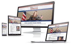
Sample Website Header Designs


See our political website design examples.
Slogan or Quote: This is optional, but if you have a great campaign slogan, why hide it? Incorporate it into the header image.
Landmarks: Readily identifiable natural or man-made landmarks make a great addition to a header, particularly when used as a background. State flags or seals also make for good backgrounds, but if you plan to use them, make sure you can do so.
The size of header, particularly its height, can vary from site to site. When we started creating Online Candidate back in 2004, most of our sites were quite narrow, perhaps a hundred pixels tall. Today we tend to make them as least twice as tall, and a candidate head shot now usually includes the shoulders and chest. Part of this is simply keeping up with online design trends, and also the fact that the average screen resolution is higher than it used to be.
Learn more about our Campaign Website Packages to create an effective, professional web presence that helps win elections. Our Regular and Enhanced Website Packages include custom design!
Read More:


Political Messaging, Campaign Mission Statements, And Groupthink »